
It depends entirely on what you mean by cheap. The two most obvious answers point to opposite ends of the world.
It is the question we get asked most, usually by a manufacturer choosing where to expand or a journalist writing a comparison. What does solar and storage cost, and where is it cheapest?
There is an answer. There are several, and they disagree. The disagreement is the most useful thing in the data, because it exposes what a price comparison actually measures.
Answer one: what you pay
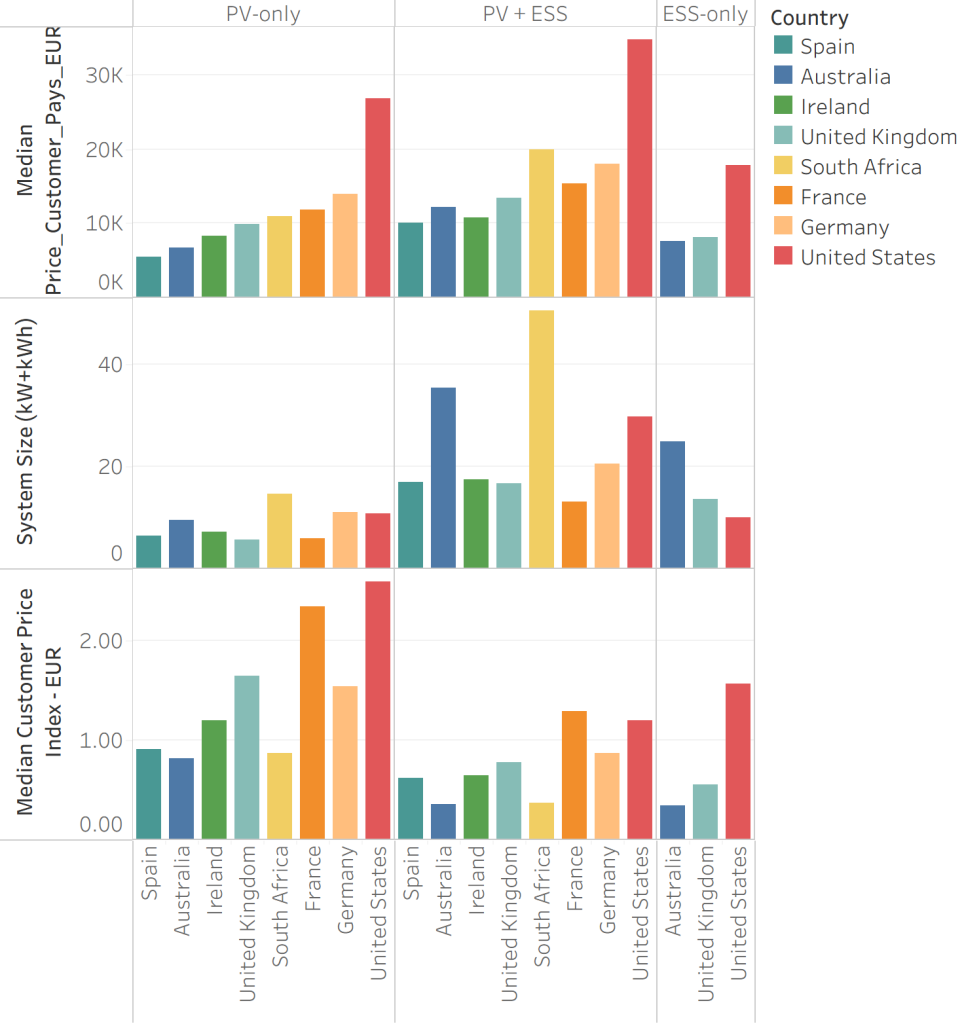
Spain is cheapest at around €10,159, with Ireland at €10,800, Australia at €12,192 and the United Kingdom at €13,465. France sits above them, then Germany at €18,000 and South Africa at roughly €20,100.
The United States is an outlier by a distance at €34,884, nearly three and a half times Spain and almost double Germany.
If you are a household, that is the number that matters. It is the invoice. It is also a poor guide to value, because these markets are not buying the same thing.
Answer two: what you get
Median system sizes run from around 12 kW+kWh in France to roughly 51 in South Africa. Australia sits at 35, and the UK, Ireland and Spain cluster between 16 and 18.
So Spain’s cheapest-in-the-world invoice buys roughly half the system Australia’s does, and a third of South Africa’s.
Rank the same markets by price per unit of capacity and the order changes. South Africa and Australia come out cheapest, at roughly 0.27 and 0.36. Spain follows at 0.62, then Ireland, the UK and Germany, with the US at 1.20 and France at 1.29 the most expensive.
Spain has gone from first to third, and South Africa from sixth on total spend to best value in the set. Two markets swap ends of the table on nothing but the phrasing of the question.
The clearest comparison in the data
The median Australian system is 10 kW of solar and 25 kWh of storage, for €12,192. The median UK system is 6 kW of solar and 11 kWh of storage, for €13,465.
That needs qualification, because the obvious conclusion, that British installers are overcharging, is not what the data says. Three things are happening and only one is about installers.
Why the answers differ
Fixed costs do not scale. Travel, survey, scaffolding, grid application, certification and a crew’s day cost much the same whether the system is small or large. Spread those over 35 units of capacity instead of 17 and the per-unit figure falls without anyone’s costs changing. This is most of the gap between Australia and the UK, and nearly all of South Africa’s position.
France shows the reverse: the smallest median solar-only system in the set at around 4 kW, and the second-highest price per watt in the world. Small systems and high unit costs are one phenomenon seen twice.
These are prices after subsidy. Our index reflects what the customer pays net of whatever support their government provides. That is deliberate, because it is what drives demand. It also means a cross-country price comparison is partly a comparison of policy regimes.
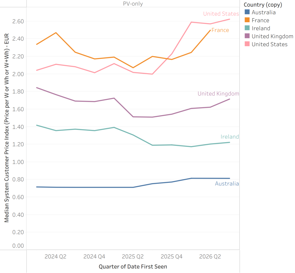
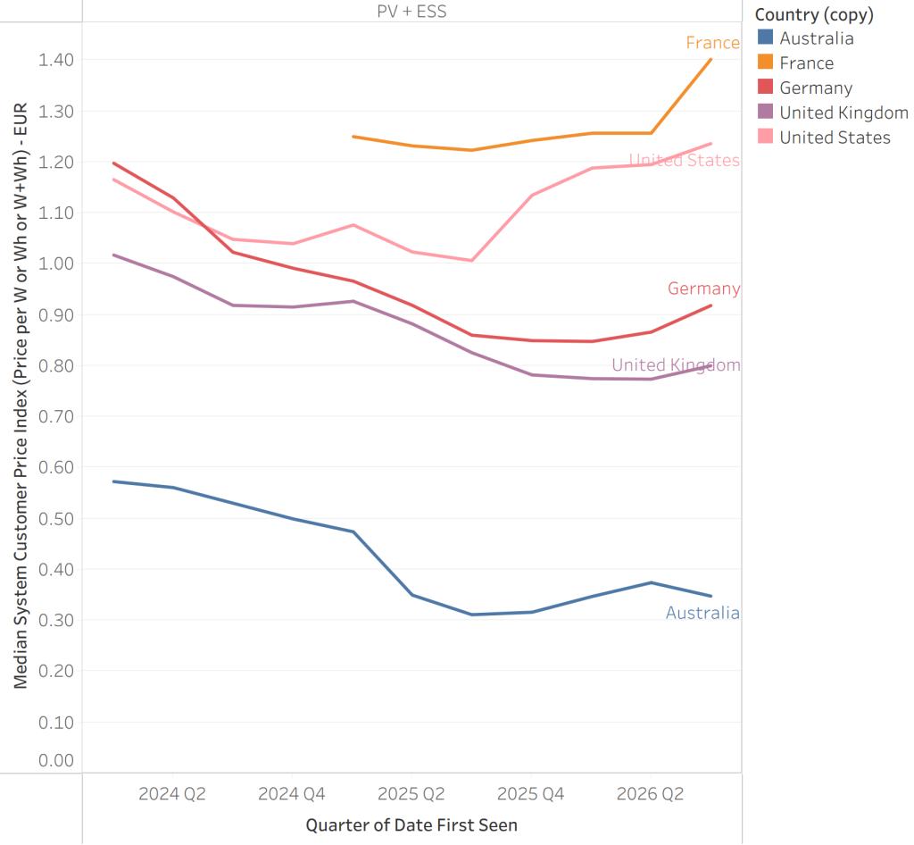
Australia proves the point inside a single country. Over the past two years solar-plus-battery prices there fell sharply while solar-only prices rose, and nothing about the cost of panels or cells did that. Battery support arrived in mid-2025 and cut a substantial share off storage costs, while solar support declines on a published schedule, so post-subsidy panel prices drift upward.
The United States runs the same experiment in reverse. The federal residential credit expired at the end of December 2025 with no phase-down and no transition, and standalone storage lost its support on the same date. Prices had been broadly stable. They then climbed steeply, and are still climbing.
Industry attention moves prices too. As Australian installers shifted focus to batteries, where the volume and the margin had gone, panel-only work became something quoted by firms that would rather be doing something else. Solar-only volumes roughly halved while prices per watt rose 14 per cent.
A segment is priced according to how much the industry wants it. Where it is the main event, competition compresses margins. Where it is a residual, it does not. That is a testable prediction for every market making the same transition: as storage becomes the default sale, expect panel-only pricing to firm.
And the direction has changed
The received wisdom is that solar gets cheaper every year. Recent data does not support it.
On solar alone, four of the five markets we track closely have risen over the past year, the US steeply and France after an earlier decline. Only Ireland has held roughly flat.
On solar-plus-storage the pattern is starker. All five markets fell through 2024 and into 2025, and all five have turned upward in the most recent quarters. Australia bottomed in late 2025 as its battery subsidy tapered by system size. The US bottomed at the same moment and has risen much faster, as its credit disappeared entirely.
Whatever was driving prices down has stopped driving, and in several markets it has reversed.
What to take from this
For households, the only honest answer is what a system suited to your home costs where you live. Cross-border per-unit comparisons mostly tell you who buys bigger systems.
For manufacturers, the market with the lowest price per unit is usually the one buying the largest systems. That is a demand signal rather than a pricing problem, and it often marks the most attractive market rather than the hardest. Australia and South Africa look cheap because their customers buy scale.
For anyone forecasting, a substantial share of what a customer pays is set by policy rather than cost. An addressable market can double or halve without the cost base moving.
And it is worth watching monthly rather than annually. The turn in these series happened over two or three quarters, and on an annual view it has barely appeared.
About the data
Based on SunWiz Luminate’s verified sample of installation activity, drawn from installer-level records across each market and refreshed monthly. Figures are median values for residential installations.
Prices are what the customer pays after subsidy. This is deliberate, because it reflects what households experience and what drives demand, but it means cross-country comparison reflects policy differences as well as cost differences. Support mechanisms differ in form between markets, including point-of-sale certificate schemes, tax credits and rebates.
The capacity measure combines solar kW and storage kWh. This is a practical convenience rather than a physical quantity, and it means markets with larger batteries will show lower blended per-unit figures. Single-technology comparisons, price per watt for solar and price per kWh for storage, are dimensionally sound and are the basis for any single-category claim made here.
2026 figures are year-to-date and incomplete. Sweden is excluded following a break in its solar-only series. German solar-only pricing is under review and should be treated as indicative. Standalone storage pricing is shown only for Australia, the UK and the United States; elsewhere standalone volumes are too small to produce a reliable median, which is itself a finding about those markets.
Currency conversion to euros applies a consistent rate basis across markets.