Australian Solar Electricity contribution reaches 9.4 percent
Australian Solar Electricity Contribution reaches 9.4% of electricity demand
Also in this series: Australian PV Contribution reaches 9.4% of electricity demand
3GW of PV – When, where and how: System sizing, pricing, and distribution
3GW of PV – which companies are leading residential and commercial PV
Really – PV nearly 10% of midday power production? Find out more in today’s mini-Insights edition
Email not displaying properly? View it in your browser.
September’s Solar Sunday – a deeper look
PV in the NEM – quite an impact
We’re kicking off our free Insights mini-series with an special feature from last month’s subscription, which takes a look at the contribution of solar power to the National Electricity Market. Hitherto it was uncertain how much solar power was contributing to electricity demand, because the ‘behind the meter’ nature of net-metered solar power systems means their production simply appears as ‘negative load’. Now by combining some publicly available resources, we can clearly see that PV is having a non-trivial midday impact, and in some circumstances representing more than one quarter of power consumption. Remember, this free release of Insights data is a once-off to celebrate the 3GW milestone being reached. To obtain such Insights on a monthly basis, you’ll need to subscribe (from $275/month).
Through work contributing to the APVA’s Development of an Australian Solar Map”, over a six month period SunWiz recorded an aggregated feed from thousands of real-time monitored PV systems (via PVoutput.org), and multiplied it by the CER-reported volume of solar capacity at the time, and then divided it by the AEMO-published electricity consumption volumes in the National Electricity Market.
SunWiz assisted the APVI with the ARENA-Funded Project “Development of an Australian Solar Map”, which presents a live view of similar information – this ARENA-funded website produced by the APVI provides live information on Australia’s solar contribution, alongside noteworthy historical events.
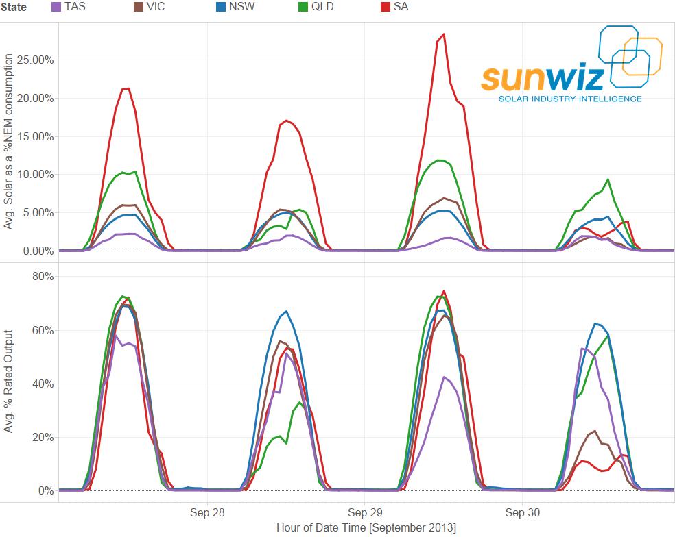
This graph shows the proportion of NEM consumption in each state that was met by solar in each hour of the day across the period February-September 2013. The blue line shows the maximum contribution and the orange line shows the maximum contribution. You can see that contribution of solar power in SA reaches over 28% at some points in the sample period, and there is a healthy average of 11% midday contribution. Queensland’s solar power systems are contributing an average of 7% of NEM demand, an reaching up to 12% on some days. Contribution is lower in Victoria and New South Wales, and lower still in South Australia.

It is worth noting that there are inaccuracies that derive from the methodology: state-wide live performance data from PVoutput.org was captured and then multiplied by the amount of solar capacity installed at the time, then divided by the sum of NEM consumption and solar output to reach the proportion of the NEM produced by solar. As a result there are some obvious data anomalies due to errant system recordings after dark in PVoutput.org. Its worth noting that PVoutput.org users produce higher than average performance, and that solar production includes all systems, whether NEM connected or not. Balancing these factors is the fact that capacity data lags installed capacity.
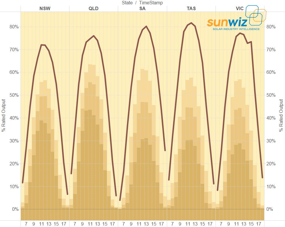
The graph below shows all data points for each state over the sample period. Clearly SA and Queenland have the largest solar contributions. Interestingly, Queensland has a period of reliably-high solar contribution over the months of August and September. After dipping through the winter months, it is clear that contribution is increasing in most states; a function of the weather and of continued installations adding further power generation capacity.
In terms of energy contribution (as opposed to midday power output), solar power contributed 1-2% of NEM energy requirements each month, but this varies considerably by state. The graph below shows the monthly contribution of solar power to NEM energy consumption in each state, with almost 5% of South Australia’s NEM energy consumption being provided for by solar power.
Applying this information to September’s Solar Sunday, we can see that Queensland Victoria and South Australia had coincident days of maximum solar contributions to NEM consumption (28%, 7% and 12% respectively), and NSW was close to its best. At least part of the reason for the extraordinary solar contribution to NEM consumption was that consumption is low on Sundays. It certainly helped that each state other than Tasmania had coincident upper-quartile solar production – in other words it was sunny across the whole NEM at once.
This extraordinary information is an example of the special feature that SunWiz puts into edition of Insights. Past special features have included: Solar Hot Spots, Global Demand, best presentations of Clean Energy Week & Intersolar, PVoutput.org, best STP graphs, Perth Solar Cities, Out-of-Pocket Expenses, 2013 Wrap –Insights will surprise you with the valuable knowledge it turns up each month.
Still to come in this mini-series, we will look at common system sizes, pricing, large-scale systems, market share, and SunWiz exclusive content.
Want more information? Subscribe to Insights
Insights into SunWiz Insights
Here’s some more information that can help you evaluate which subscription level is for you. There’s some great sample graphs included at the bottom of this email.
Insights for Manufacturers
- System prices reveal what mark-up is being made on your product, and how competitively priced it is.
- Panel manufacturers can see the import volumes into the country, and the country of origin.
- For inverter manufacturers it also identifies the numbers of each size of system installed, so you can track your share of each sub-segment of market size associated with your range of inverters.
- Monthly market data provides the ability to track your market share on a per-state level.
- Monthly market data also reveals growth or contraction in the market.
- Insights Premium (recommended) allows you to identify potential customers in the top 50 nationally and top 20 in each state, and to track their performance. It also allows you to identify your share of their overall business (and whether it is growing or contracting).
- Insights CustomID (encouraged) allows you to pick out any company creating STCs and identify their KPIs – volume and average system size in each state incl growth and contraction, plus distribution of system sizes.
Insights for Wholesalers
- Wholesalers can identify potential clients to target. The top 20 nationally and top 10 in each state are included in our Insights standard package.
- Insights Premium (recommended) allows you to identify potential customers in the top 50 nationally and top 20 in each state, and to track their performance. It also allows you to identify your share of their overall business (and whether it is growing or contracting).
- Insights CustomID (suggested) allows you to pick out any company creating STCs and identify their KPIs – volume and average system size in each state incl growth and contraction, plus distribution of system sizes.
- Some Wholesalers create STCs; the size and volume of the systems they register can be identified
- Monthly market data provides the ability to track your market share on a per-state level.
- Monthly market data also reveals growth or contraction in the market.
Insights for Retailers
- Retailers can identify emerging trends in popular system sizes
- Retail system pricing data also helps you competitively price your product, depending on its location and components
- Retailers can see how their competitors are faring, and glean insights into their strategies.
- Insights Premium (recommended for large retailers) allows you to identify the system sizes installed by each player in the national top 50, allowing you to identify which competitors are doing well in your specific market segment.
- Monthly market data provides the ability to track your market share on a per-state level.
- Monthly market data also reveals growth or contraction in the market.
World’s best solar consulting houses are envious
When I attended Intersolar (the world’s biggest solar trade fair) in Munich in 2013, I stopped by my international competitors – the likes of IHS and GTM. They’d all heard of SunWiz, and knew there was little point in trying to supply PV Market Intelligence to the Australian Market. Put simply, having seen what SunWiz does, the world’s biggest solar intelligence providers are envious of the depth of information we provide.
Australian PV Companies trust SunWiz
Indeed, many foreign PV manufacturers based in Australia have been fed up with the garbage figures on the Australian market their global head offices were being fed by SunWiz’s international competitors. They use Insights to show their head office what’s really happening in Australia. When the global CEO of a large Australian PV company visited the country, SunWiz was flown down to Melbourne to speak with him personally.
When you’re ready to make a decision, you can subscribe from our website using credit card via PayPal or request that I send you an invoice for direct deposit.
Insights into Insights
Insights is subscribed to by most of the top players in the Australian PV Industry. This includes 11 of Australia’s PV Retailers (including each of the top 4 plus major solar utilities), 6 of the top PV Wholesalers, and eight of the major PV component manufacturers. If you’re creating STCs for yourself, it’s likely that they know more about your business that you realise. And if you’re not self-creating STCs, you can fly under the radar while performing espionage on their strategies.
Here’s a description of what’s included in each subscription level.
To learn more about what we can do for your solar business
visit www.sunwiz.com.au
- Great guerilla marketing photos of solar power… http://t.co/KGyiRy8Wfm
- ZEN Energy and Business SA partner to provide commercial solar over 5-7 year rental plan http://t.co/ty4hdOnJhj
- SunWiz was featured in The Courier Mail: Solar panels turn suburban homes into QLD’s fourth biggest power station http://t.co/q4eEOr3Xm2
- RT @The_RiotACT: Three new power plants for you: Photon Energy are planning to build three mid-sized solar power plan… http://t.co/Fd2OJR…
- RT @ClimateSpec: EDIS: Campbell Newman’s electricity tax by stealth http://t.co/yH5mJHoZgI
- APVI study explained: from base case of $1735/year electricity spend, installing an AC will raise your spend to… http://t.co/6AXlEEMYIo
- APVI: PV systems producing 20% of capacity during local distribution network peak demand http://t.co/Tb0I4DIKKI
- SunWiz leads ClimateSpectator – who’s leading commercial markets. Great graphs (even if I do say so myself…)… http://t.co/47jZhKMzS2
- AEMO: 13% of additional generation to 2020 will be solar PV… http://t.co/qK4Rdumere
- Time to get facts right on solar, and reap the benefits – Centre for Policy Development and APVI http://t.co/l3NCvMfAmF
- RT @renew_economy: CEFC saved in the Senate – a rare win for Australian renewables http://t.co/nZfdcBCJ8l #solar #wind
- RT @SimonChapman6: God takes a selfie http://t.co/664s5ZIRUJ
Copyright © 2013 SunWiz, All rights reserved.
You’ve been sent this email because you’ve expressed interest in Insights, SunWiz’s PV Market Intelligence. Inclusion on this email list typically follows a purchase, subscription, or direct expression of interest
Our mailing address is:
Byron Bay, NSW 2481