
Islands of solar joy amidst the pain
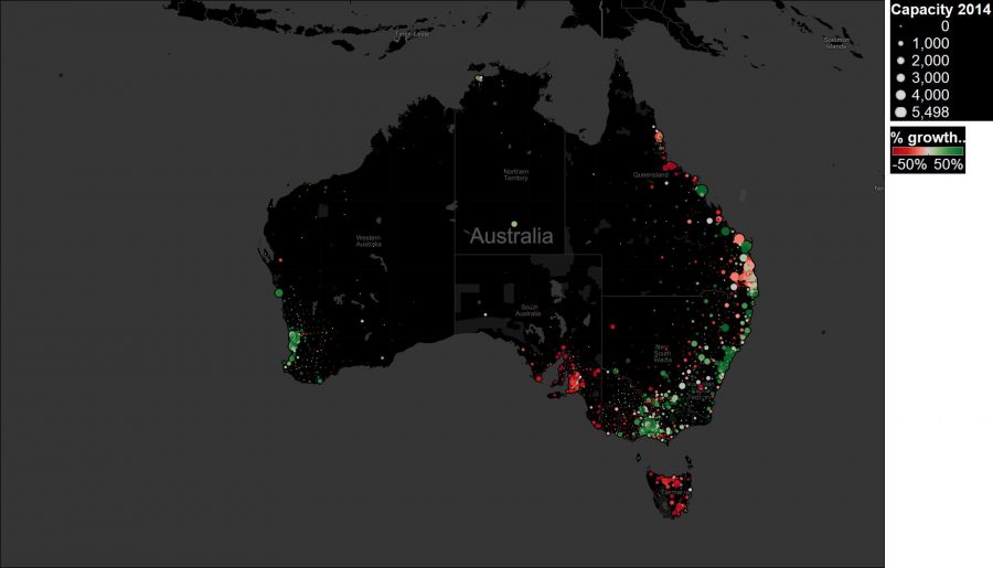
I’ve written before about the difficulties facing the Australian solar industry in 2015. Volumes in June 2015 were 20% below volumes at the same time last year. But amidst the vast ocean of pain, there are sunny islands of joy. To provide an easily comprehensible example, this chart (an analysis of Clean Energy Regulator data) plots how each postcode fared in 2014 compared to its 2013 volumes. The colour shows the amount of growth or contraction that occurred in 2014 compared to 2013 volumes, and the size of the dot indicates the volume installed in 2014.
The chart demonstrates the significant contraction that occurred across all of South Australia, Tasmania, and the ACT in 2014. Much of northern Queensland suffered a similar fate, though there was growth in the sunshine coast and beyond. Conditions were favourable in Sydney and the northern coast of NSW. Victoria’s growth occurred over much of the state, though most installations were concentrated in the central part of the state. Meanwhile WA had a growth year, though much of its volume was concentrated around Perth, in contrast to previous years.
The situation in 2015 isn’t so broadly impressive, with most of Australia’s top postcodes experiencing a solar recession. This makes it all the more important to know which postcodes are growing, so that sales activities can be targeted towards where they are most likely to bear fruit. SunWiz offers Hot Spot information on the commercial and overall market which can assist in more cost-effective sales departments.